[process] nirvana in fire x persona 5
Feb. 16th, 2021 01:04 pm
For
For the prompt: ensemble cast | persona 5 au, feel free to follow the plot of p5 or to use the setting/lore as inspiration! notes: bonus points for character study-esque writing and using the mcs/linshu naming conventions cleverly; happy ending please
At the time I was creating it, I was also doing a lot of tedious work at night, and I was working on NiF Exchange in bits and pieces to give myself a break. I mostly remember the backaches and basically had to avoid being on the computer on my downtime for like 2 years. :)) I have an office chair now, though, and life has been better (and more productive) because of it. Can't believe I waited til 2021 to get one. /o\
tl;dr - summary of the process:
WARNING: Mega-long and image-heavy post ahead!
Visual development
Color and Design
INSPIRATIONS:Persona 5 anime OP (watch it here)

Persona 5 OP (watch it here)

Persona 3 OP (watch it here)

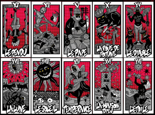
Persona 5 tarot cards [tumblr source]
I LOVE the visual design of the Persona series, the use of simple-looking lineart and silhouettes for maximum effect? I started out basing my palette/look on the Persona 3 OP design because I felt it suited my abilities best—sparse lineart with no faces, and a safe shade of blue as its background, and a somewhat neutral feeling. I loved how colors, text, and other visual elements popped boldly from it. I'm not sure when exactly I conceived the idea of using cards to tell the story visually, but I eventually fell in love with the idea of MCS and LS being a single card with two faces.
At this point I still had no idea how AE worked, so you can actually.... see me get a bit better as I get further into the vid LOL


^ A layout I drafted in Photoshop to help me visualize what I wanted to happen
Card designs

For the tarot designs, I was very sure I wanted the red, black, and white palette of Persona 5, but didn't have a clear or attainable vision for the Phantom Thief cards. Initially I was vector-tracing screencaps and photoshoots of Hu Ge and Nihuang in modern-day roles, because I wanted the contrast between the "classic" arcana versions and the slick modern-day heist roles. In the end I realized they would not be recognizable this way. It also felt like there were too many elements in the card design, and I didn't know how to arrange them in a way that made sense when you looked at them: code name, mask, faceless vector illustration of a character who could be anyone, and the actual name of the character. There were too many details fighting for attention and no clear path to information.

So I went back to the red/white/black color scheme, ditched the people, and just used the respective masks as the centerpiece. If you know Persona 5 at all, the masks will make sense to you. All but Lin Shu's mask design are taken from the Persona 5 Phantom Thief mask designs, corresponding to a specific character. I ended up using the Phantom of the Opera mask for Lin Shu for... reasons. (1) STILL A ~PHANTOM~ THIEF LOL, 2) Dramatic and self-loathing, 3) I just liked the prospect of halves and asymmetry? To be honest I no longer remember my thought process. I don't think it matters, ultimately. XD

Here are some other design ideas that I completely forgot I did, but found in my folders—designing the Phantom Thief cards was probably the hardest part for me! Between my lack of skill and scattershot brain, I just couldn't come up with a design that was pleasing to the eye, logical, and consistent. In the end paring it down and simplifying it was the best answer, and I'm very glad I got there.

Vidding
Learning to vid
I've never vidded before this (and have only one one after this), let alone used AfterEffects, but I thought it couldn't hurt to try? I have very little to offer when it comes to technical skills, compared to people my age who have accumulated a large body of work and people younger than me who grew up with more resources. But I found that having so much less time and energy to spare has completely changed my approach to personal projects and made me simultaneously more patient and efficient. And as much as I wish I was better, it does make me feel better to realize, in retrospect, that uncreative and internal changes can have external creative results.Learning was mostly sitting down and watching entire 20-minute tutorial for a motion typography video to get an overview of how things worked.
I did follow a step-by-step tutorial for the card flip effect—but I wouldn't have been able to follow it if I hadn't watched someone animate typography for 20 minutes.
Anyway, being a complete video editing n00b, I still did some of the ~~animations~~ in Photoshop. XD The little clip of MCS disappearing is actually based on a gif I was playing around with on March 2018. I shelved it because I found it ugly but I guess now that something came out of it, I can post it now.

For the vid, I thought I'd add a glitch effect because glitch effects were pretty trendy on Tumblr! The next iteration was still ugly, but it was ugly with a Purpose, so here it is:

And here's the final version! It doesn't have the same "disappearing"/self-deleting effect as the early ones, which I really liked conceptually. But it is more visually appropriate in the context of the rest of the vid. Plus, the flat colors and extra space made it easier to typeset the lyrics.


Visual effects & background
I did a fair amount of masking for the vid. I don't remember how I did it, only that I did it very inefficiently. XD I was mostly inspired by the Persona 5 anime opening (it's also where I got the title of this work from), which had a lot of split-screen effects and leaned really hard on dualities, which I loved. I highly recommend watching the 2-minute opening video:The stars and halftone patterns were replicated from the Persona 5 menu design and general visual theme:

I did the backgrounds on AI and PS, and imported them in AE. They didn't need to be exactly the same as the game, they just needed to look familiar.


AI work
I feel that no one really believes me when I say I only trace, not draw, so here's a look at my artboards! Since I was planning for the vectors to have a more "illustrated" and detailed look, I created (by tracing with the pen tool) the lineart first, then filled in color afterwards. I'm only really able to achieve this in Nirvana in Fire because the robes are nice and loose and conveniently hide the hands, and every major character already looks pretty distinct even when you reduce them to a collection of shapes and remove all the color. Even without knowing Chinese history, you recognize characters by the accessories, the types of clothing, and the body language. (I am very sorry for not tracing the dragons on the emperor's robes properly, or doing more research....)My mistake was not setting up color swatches. I just used the color picker? And sometimes just eyeballed the values. So uhhh they're not all the same shade of red or gray..... Oops. I now know to take the time to set up swatches and generate a global swatch palette. (Well, mostly. I still Google the procedures haha.)


I think I spent the longest on Emperor!Jingyan and his hat dripping with beads. I couldn't figure out a way to make it easier for myself.

I did the card designs in Photoshop. The earlier drafts look ridiculous but at that time I was very earnest about them.

Fun fact: I couldn't manage to draw fire, so the "fire" in the background for both LS and MCS, in fact, just the Chiyan logo (without the circle) that I duplicated all over the canvas. The colors are reversed in the MCS version, so you get more fire from Lin Shu, but smoke and ash from Mei Changsu. I thought this portrayed their situations and internal landscapes quite well.

The symbols are mostly to add color accents and break up the background, but a lot of them are alchemy symbols I copied from a couple of webpages like this and this. I didn't investigate any further than skimming online. They're not really deep, and I wasn't very consistent with whether they're connected to the character or the archetype or just the way I perceive the characters. My choices for the Lin Chen design and arcana alignment were wholly deliberate, though!


Presentation
GIFsI don't really have much to say about this! I animated the Phantom Thief cards because it really worked with the concept of dual/hidden identities. And, since this project has so many pictures, I thought it would be great to force the potential viewer to slow down and linger and take the time to process the concept. I feel that if I'd just presented them as static images side-by-side it would have not worked as well.
WEBSITE
For the carrd website, I wanted to have control over how the content was presented and just really missed having websites for personal projects! I actually signed up for a lot of services like Wix.com but never followed through. I just wanted a simple customizable page that was also responsive and allowed you to divide your content into sections so as not to overload people with information. I think I was Googling tools for webhosting/simple single-page portfolio websites, and carrd.co happened to have the functionality I needed. and it was easy to set up. I found out a few clicks later that Tumblr/fandom people were using it as their profile page which I made me feel nostalgic for personal websites and webportals. XD
I eventually did also end up producing the tarot cards + phantom thief cards for

I had to design the back of the tarot cards, but it was quick and simple work. I wasn't printing enough to be able to add gold foil so I just slapped on a faint metallic texture and printed as is.

I still feel really embarrassed because I didn't design a box for it because I didn't know how to go about doing that. /o\ I also wanted to buy one of those velvet drawstring pouches for tarot cards, but the point was not to spend money. ^^;
Conclusion
So, that's that! This entire project, both the tarot cards and the video took me a month. (I was switching between them a lot.) It was a very slow but somewhat systematic process. I’m not innately creative or good at art, but I have pretty clear goals and good taste and sometimes that’s enough. It was a long process of making a series of ugly things with no way of knowing if I was ever going to break out of the ugliness, but I made it out in the end! There are small, individual parts I still wish I can fix but they’re no longer as important when the whole of it is solid and cohesive.I'm very pleased to get feedback that they're all recognizable even without faces. If you look at the earlier versions (especially Nihuang), they didn't used to be. I also made it a point to focus on accessories.
Here's one last Xia Dong design that didn't make the cut. Xia Dong was very hard for me to work with. And with this outfit she could have easily been Xia Qiu or Xia Chun.

I had a really hard time finding a screencap where her hands were obscured (I could have just looked harder but I didn't have the energy) so I just... cropped out the hands out in the final version. It doesn't really work, it looks awkward, but I'd spent too much time redesigning and redesigning and had to let go. That's why I have so many versions of her. XD
And one last fun fact: the Moon arcana was originally going to be Consort Yue but the idea of drawing/tracing her accessories................ /o\ I was very relieved that Consort Jing's position ensured she had less elaborate robes and headpieces for more of the show. Anyway, it all worked out in the end.